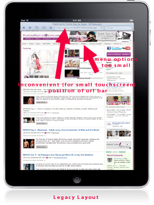
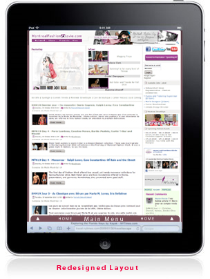
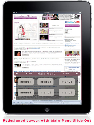
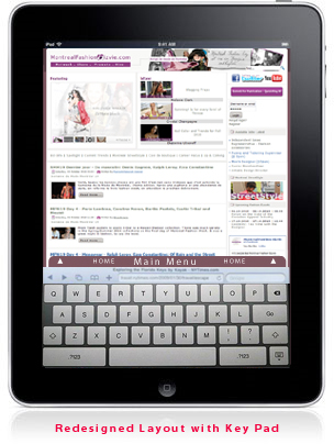
Touch screen tablet devices offer consumers a blend of convenience, intuitive interaction, media and technology. These easily operable devices are great to read/consume online material and/or for casual web-surfing. It almost seems like a no-brainer that these devices will be adopted en-masse. Especially so, since Apple has done a great job at product design and positioning, while introducing the ‘iPad’.
Recently, there have been a spate of announcements from other manufacturers who will be soon offering their own touch screen tablet devices.
With convenience, ease-of-mobility, functionality and the expected rise in number of choices, these are probably going to be the device of choice for the average person to consume information and media. Well, until Google TV or something else comes along to show us different.
These developments when coupled with the popularity of mobile touch screen phones, could point to the fact that some of the ubiquitous website/blog design and layout elements are due for an overhaul. It will be necessary to accommodate developing trends in user interaction, especially if these touch screen devices become even more popular.
Here are some earlier mentions on the topic, mostly iPad-centric, by other folk. On the iPad and Web Design. Web Design for ipad.
However, in this post, I seek to explore broader changes that may soon become imperative across all touch screen devices (thus affecting many interface design elements that are desktop mindset legacy).
Some thoughts on areas that could benefit from layout re-design (without considering implementation roadblocks):
1) The top menu bar: no more?
Yes, the top menu bar was convenient when one had to drag a mouse across the interface. However, when you want things just a ‘thumb-click’ away, it probably makes more functional sense for the menu to be positioned at the bottom of the screen.
The menu buttons (click-able area) would also have to be much larger which would mean a loss of screen real-estate. A slide out tray would probably resolve these issues best.
The ‘Slide to navigate’ action seems to be an intuitive way to navigate and the new menu bar (with larger buttons) could probably be tucked away to slide in/out as per user action. Maybe a slide ‘up’ instead of a slide ‘right’/’left’ would work well for both the left as well as right-handed.
The web browser url/title bar position: Maybe the browser title bar ends up at the bottom of the device screen, to accommodate changing user interaction needs. I guess this will require all the dominant browser makers to work and make it happen.
2) More slide in/out trays and large buttons.
Its also likely that access to social media networks will also be integrated via ‘slide’ trays and/or larger buttons.
3) White space. Thumbnail driven content access.
Thumbnails would offer more thumb click-able area and when accompanied by a working title would probably take precedence over text driven content. So would the usage of whitespace as an effective way to balance content with aesthetics.
The homepage of www.joinred.com is a close example, of design that is thumbnail/image driven. An added bonus would be not having to do a zoom on any pop up options. Any pop ups would need to incorporate larger text/graphic elements to minimize zooming in/out. Then again, pinch-zoom is fun!
4) Other design changes to accommodate portrait mode.
Desktops have imposed a landscape viewpoint on most of us. This mode is not the most convenient when you are holding a touch screen tablet device in your hands. The closer ones hands the more ergonomically comfortable, for the average person, even without considering the legacy orientation of most print material that we have grown up with. With this in mind, in the case of these hand held devices, the portrait mode will probably dominate the future. Over the short-term, we are likely to see designers trying to accommodate both modes.
I am sure there’s much more to add. Your thoughts?


